What did I do…
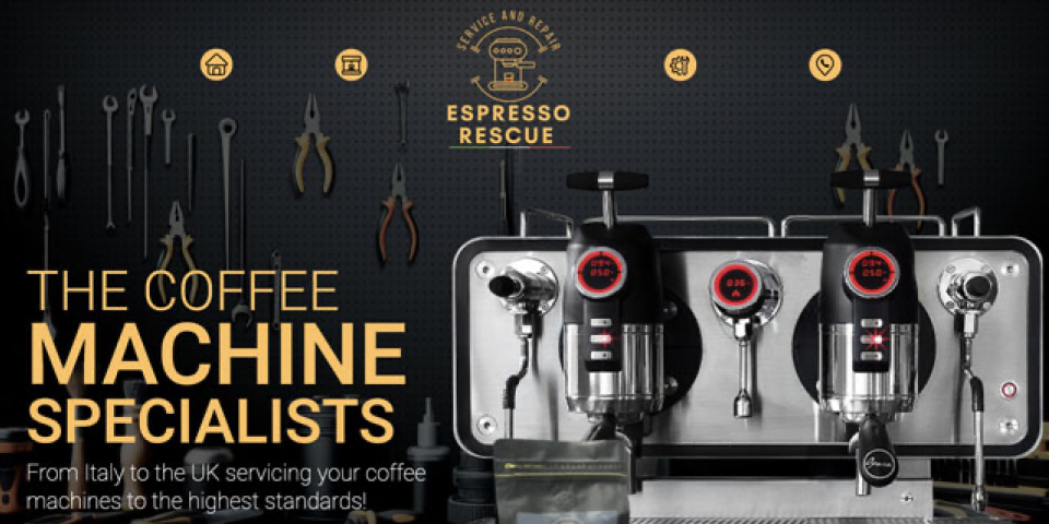
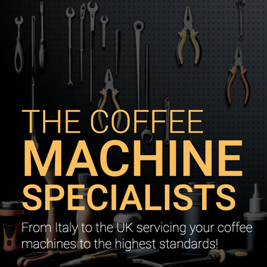
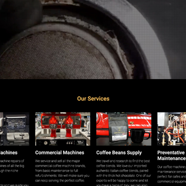
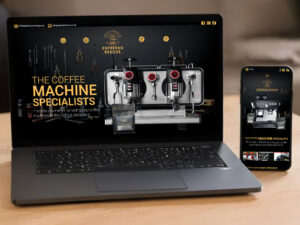
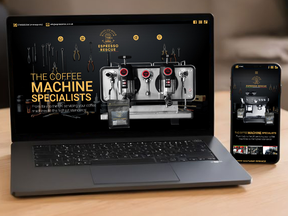
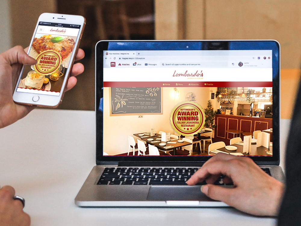
Clear and Professional
These elements can effectively enhance user experience, highlighting Espresso Rescue’s professionalism and reliability.
Dark Background: Use a professional dark background with contrasting elements.
Brand Colors: Incorporate client’s logo green, white and red for consistency.
Clean Layout: High-quality images, simple layout, intuitive navigation.
www.espressorescue.co.uk
Rebrand and profression
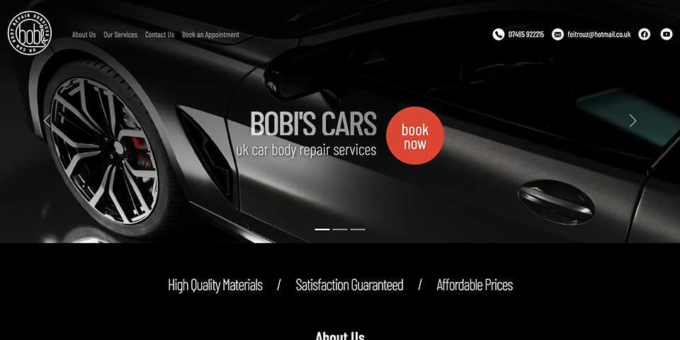
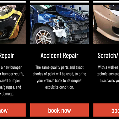
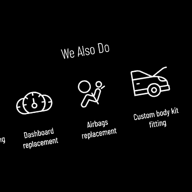
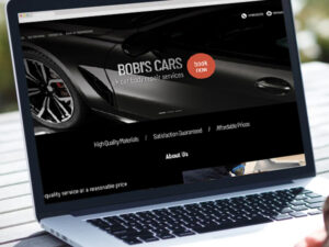
Design concept for Bobi’s Cars might include a clean, modern layout with easy navigation. Key elements could be a prominent homepage featuring high-quality images of their repair work, a clear menu with sections like Services, About Us and Contact. Integration of an online booking system, customer reviews, and a blog for tips on car maintenance could enhance user engagement. The design should prioritize responsiveness for mobile devices and SEO optimization for better search engine visibility.
https://www.theonionism.com/jobs/bobicars/
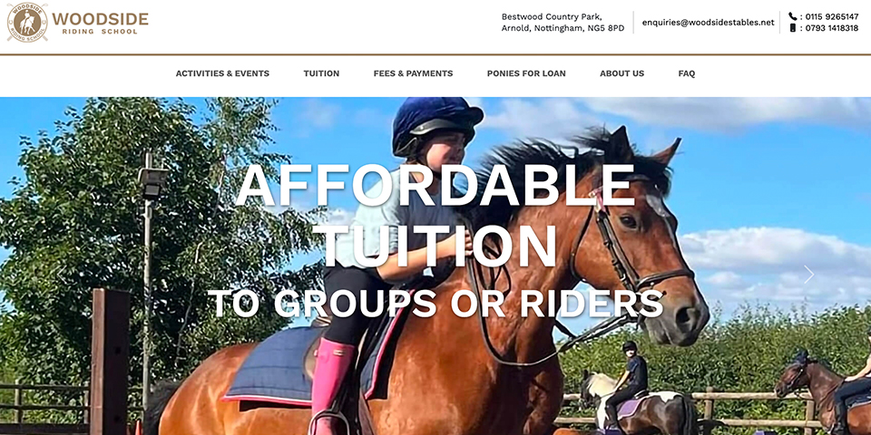
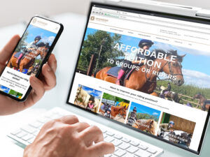
Improve brand and website
Re-layout the entire website to make it look more comfortable and natural
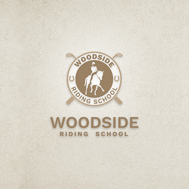
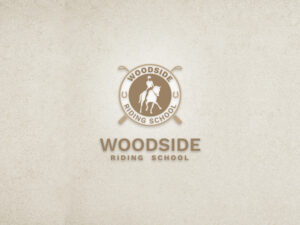
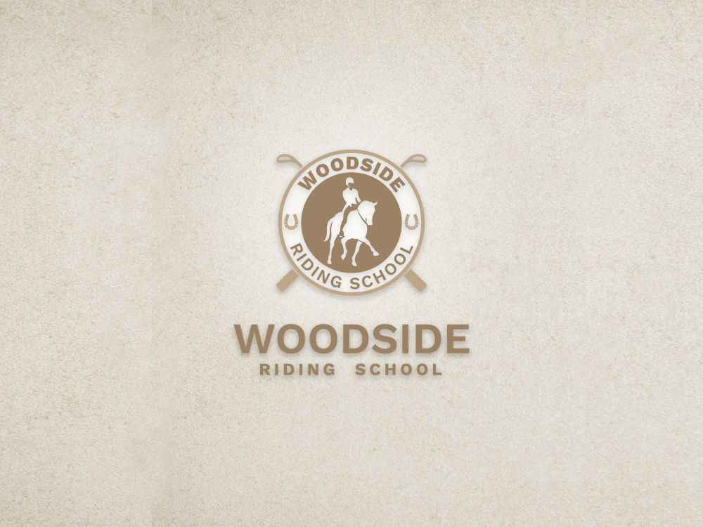
Iconography: Incorporate elements that represent horse riding, such as a horse silhouette or a rider.
Background and Color Scheme: Use white as the main background color, complemented by woods and browns to create a natural and welcoming atmosphere.
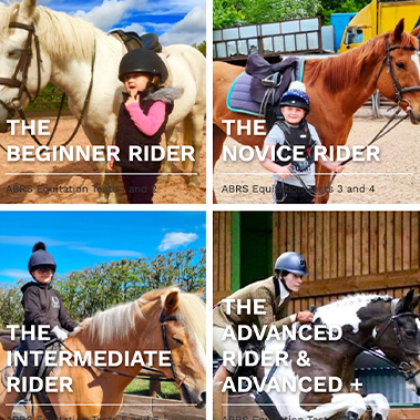
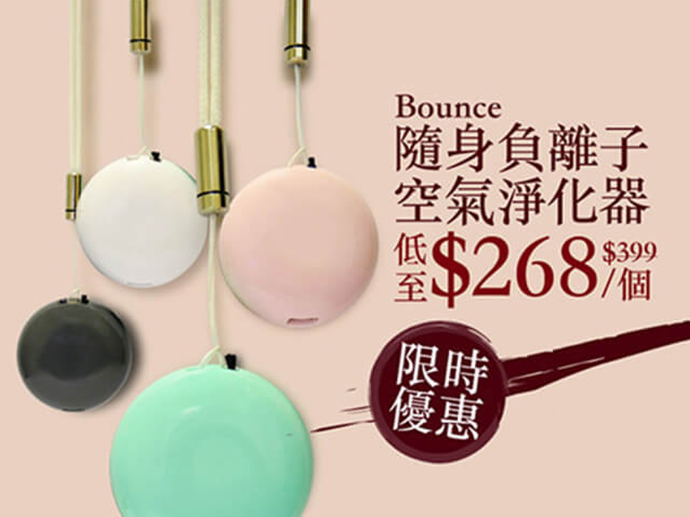
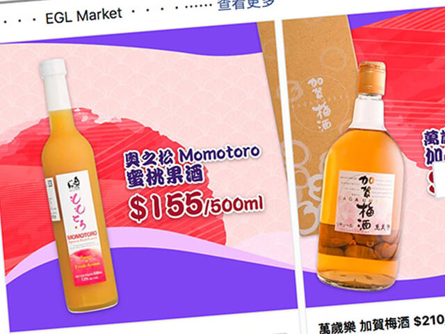
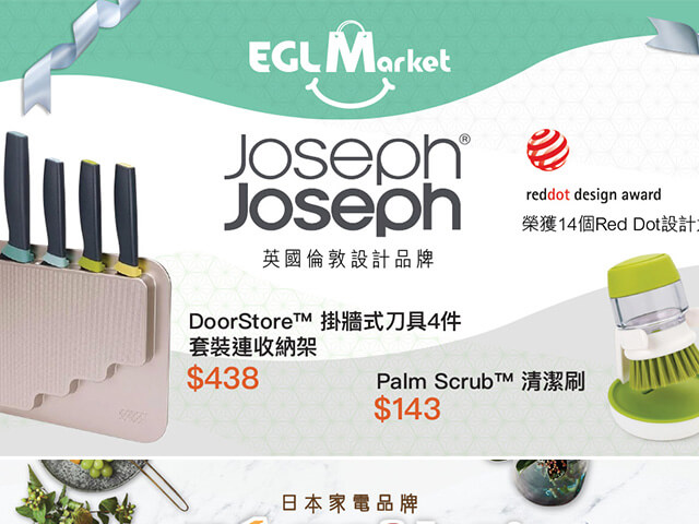
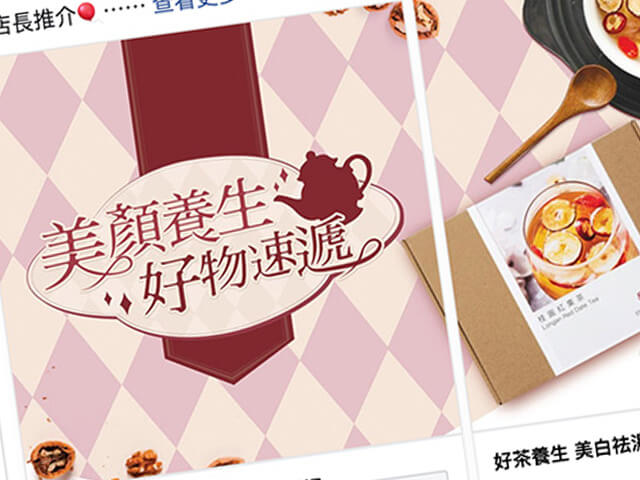
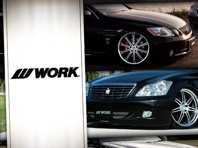
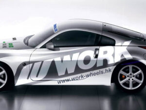
Recategorizing the catalog: makes it easier for customers to find what they’re looking for


